Overview
Need something to immediately share with stakeholders? Want to dig in to discover deeper insights? Or bolster the analysis you’re already performing outside of Remesh? We’ve got you covered.
Learn how Remesh’s Analysis Results tools help you quickly and easily analyze and share key findings. View conversation data for qualitative and quantitative questions, utilize pre-selected and on-the-fly segments to dig deeper into target audience groups, and export your findings in Powerpoint, CSV, or PNG formats to share and present to your team.
Included in this Article
- Analyzing your results
- Things to know about Remesh's Analysis tools
- Analysis Results tab
- Quantitative Statistics
- Metric & Measurements
- Visualizations
- Combining Analysis tools for powerhouse presentations
How it works
With Remesh you can analyze response data the moment your Live or Flex conversation begins. But the majority of the analysis comes to life after the conversation has ended. After a Remesh session has ended, view conversation data and participant feedback on the Analysis ![]() page.
page.
In the top left, you will find the Results tab. Here, you can navigate conversation data question-by-question, utilize pre-selected and on-the-fly segmentation to dig deeper into target audience groups, and export your findings to share or present to your team.
Things to know about Remesh’s Analysis tools
Remesh helps you better understand responses in a matter of minutes using our AI-driven algorithm. It’s powerful, but unique, and there are a few things to know about the data before you begin your analysis:
- Remesh uses both qualitative (open-ended questions) and quantitative data (poll & ranking questions).
- The data collected with Remesh should be considered directional.
Analysis Results tab
After a Remesh session has ended, you can access conversation data and participant feedback on the Analysis page. This is your analysis hub. On this page, you can start organizing, analyzing, and sharing important findings immediately.
- Create custom visuals to use for presentations.
- Export CSV files to use with other analysis platforms.
- Dig into conversation data question-by-question.
- Make discoveries about target audience groups.
- Identify and confirm themes or major ideas that surfaced during the conversation.
- Create a side-by-side comparison view of verbatim responses from a question for up to 11 audience segments.
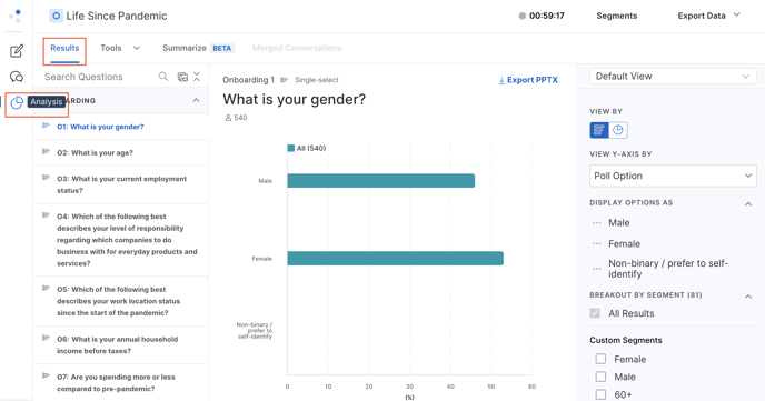
Quantitative Statistics
Quantitative statistics introduces numerical values to poll options and allows you to see overview statistical values around those values.
- To see quantitative statistics, select a poll question from the left panel, and click the table view.

- The top table will show you each poll option, the count of the number of participants who selected each option and the associated percentage. You will also see a “value” column. This column is editable, and assigns a value to each of the poll options that will be used to generate the statistical summary. Adjust these values as you see fit, then click “Save and Recalculate”

- When you click “Save and Recalculate” the Statistical Summary table will adjust accordingly. The numbers in this table are based upon the “Value” column in the above table.

- Mean: Average for dataset
- Median: Number in the middle of that dataset
- Standard Deviation: Amount of variation for this dataset around the mean
- Total Count: Total number of submissions for participants. This number will equal the total number of participants for single select polls, but may be higher for multi-select polls.
Metrics & Measures
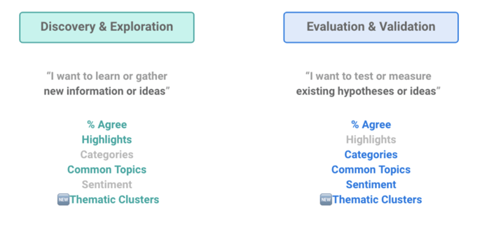
Whether you want to understand the major themes of the conversation or pull out specific responses to support your analysis, there are a variety of metrics available to help you quickly digest and analyze conversation data.
Below is a brief description of metrics found in the Results tab. Learn more about these metrics and when and how to use them here.
- % Agree estimates the % of the audience that agrees with a response to help you categorize and group the top responses.
- Categories organize responses into groups defined by you as the researcher.
- Common Topics surface notable keywords that frequently appear.
- Sentiment assigns “Positive,” “Neutral,” or “Negative” responses.
- Thematic Clusters surface key themes based on the meaning of responses.
- The Topline Report can be easily exported for a ready-made presentation with Conversation data
Visualizations
As a Remesh user you have access to a variety of visualizations that can be exported as png or Powerpoint files to be used for presentations and analysis. To export, simply click ⤓ Export PPTX or ⤓ Export png in the top right corner of the visualization.
Quantitative visualizations
-
Create a custom bar or pie charts for responses, breaking out your data by audience segments. You can read more about segments here.

-
Click the three dots next to a poll option for additional options. Rename individual labels by selecting Edit label and typing in a new name. Group multiple poll options by selecting Group Options, choosing the poll options to form a group, labeling this new group, and saving.

-
Visualize data from a Rank question as a stacked bar chart showing each option's voting distribution or as a table showing rank order and count. Click here to learn how Remesh calculates the weighted score for a Rank question

-
After creating a unique view of the data, click Save View to save this view within the platform and return at a later time. View all your Saved Views by clicking on the dropdown menu in the upper right of the screen.
Qualitative visualizations
-
There are a variety of visualizations that bring important qualitative data like key themes and sentiment to life. Create and export these visualizations from your Ask Opinion and Ask Experience questions.
-
Topic Cloud and Topic Prevalence Chart: A Topic Cloud is a great way to very quickly get a snapshot view of key topics, whereas a Topic Prevalence chart depicts the percentage of responses that include a common topic.


-
Sentiment Chart: Shows the spread of sentiment among responses.

-
Thematic Clusters Chart: Shows the prevalence of themes based on meaning.

-
Category Chart: Depicts the percentage of Ask Experience responses that fit into each category.

-
Just like the quantitative visualizations, you can break out your data by audience Segments. You can read more about analyzing Ask Experience questions in Results here.
Combining Analysis tools for powerhouse presentations
Now that you’re more familiar with the Analysis tools available to you on the Remesh platform, here are some ideas for pairing these tools for even more impact.
- Build onto the Topline Report to highlight important data. For example, perhaps there’s a question where a side-by-side comparison view of two different segments and their agreement scores could add valuable detail to your report.
- Show an in-depth and engaging view of Open-Ended responses to a key question. You can create a Topic Cloud to visualize keywords, summarize the sentiment of responses, and pull example responses with polarizing agreement scores. This combination provides an overview that’s representative and visual.